Personas
Personas are a way to cluster respondents so that you can view and compare data for various respondent groups. This page provides an overview of how to configure and use personas to improve your data analysis.
What's on this page:
Why Use Personas?
Personas (sometimes referred to as "segmentation") allow you to create groups of respondents based on answers to one or more survey questions, and then compare data between those groups. For example, you may want to see how responses differed between respondents with children aged 0-12, respondents with children aged 13 - 18, and respondents without children. Personas allow you to quickly and easily see how responses differed between different groups in your audience.
Manually Create Personas
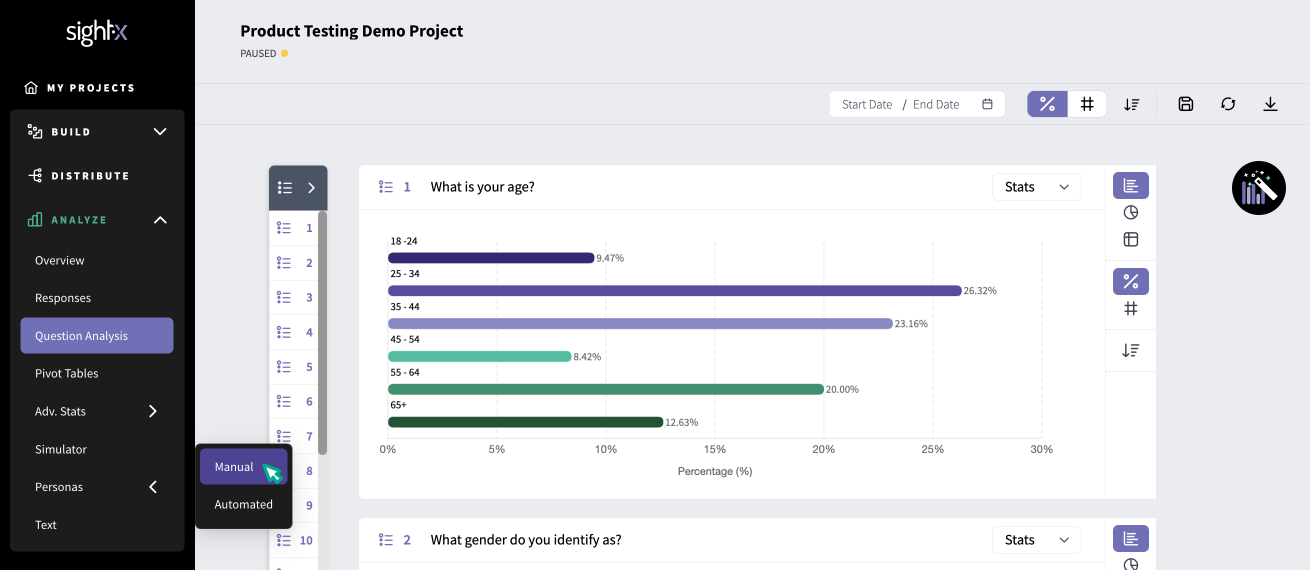
If you already have an idea of the groups of respondents you want to compare data between, you can set them up as Manual Personas. In the Analyze section of SightX, click on the Personas tab in the left navigation pane, and select "Manual".

Click the "+New Persona" button to create your first persona. Enter the name of your persona, which will be shown in the legend of all comparison charts, and an optional description. Next, click the "+ Add filter" button to add variables to define your persona.
For this example, we'll create a persona called "Employed folks". To create this persona, we'll add filters for respondents who are age 18 - 54 and who are employed.

When you click on the button to add filters, you'll see options to add a filter based on Question, Concept Test, Campaign, and Channel.
- Question: characterize respondents based on their answers to survey questions
- Concept Test: characterize respondents based on which concept(s) they were exposed to
- Campaign: characterize respondents based on which campaign they came from
- Channel: characterize respondents based on how their response was collected (panel, email invitation, social media link, etc)
In this case, we'll choose "Question", and then select the survey question and answers that apply for this persona.

Next, we'll add another filter to the persona for health-consciousness. Click the "+ Add filter" button inside of the rectangle to add another question from the survey. When you've added all of the filters you want for the persona, click the "Add" button in the upper right corner.

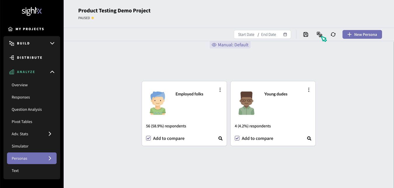
Now, your persona should appear on the dashboard, and will include info on how many of your survey respondents fall into that persona.

Create as many personas as are relevant for your research by clicking the "+ New Persona" button in the upper right corner.
When you're ready to compare the data from the personas you've set up, click the checkboxes on the personas that you want to compare. You do not need to compare all of the personas at once.

Then, click the "compare" icon button in the upper right corner of the page.

From there, you'll land on the comparison dashboard, where you'll see a data visualization for each question in the survey, with a data series for each of the personas you're comparing. Here, you can conduct your analysis as you normally would on SightX, and utilize toolbox functions like filtering and weighting.

Automatically Create Personas
If you don't have pre-existing personas to inspect, you can use SightX Automated Personas to create clusters based on behavioral or psychographic data collected in your survey. The clustering technique relies on optimized K-Mean Clustering.
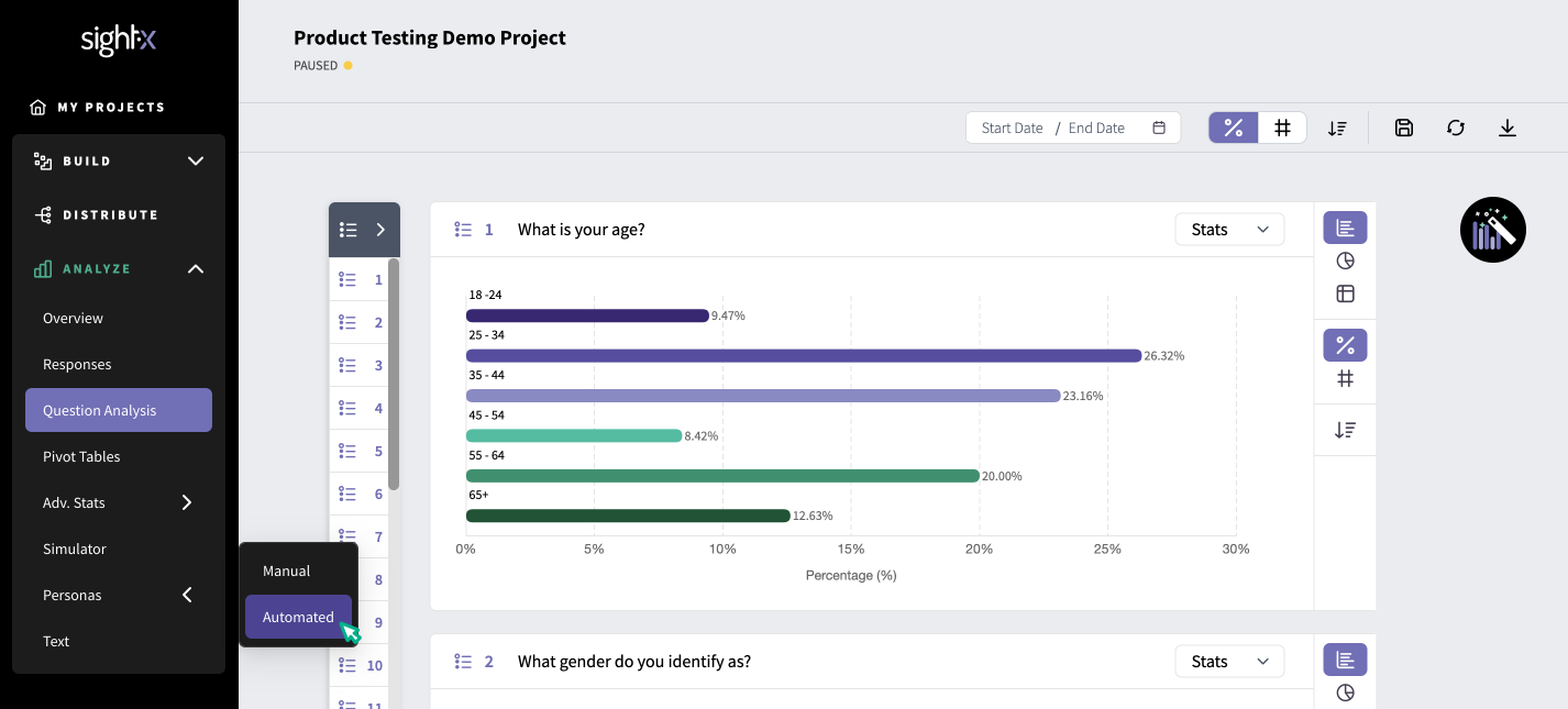
First, navigate to the Automated Personas module by clicking "Personas" in the left navigation pane, and then selecting "Automated".

Enter the number of personas you'd like to create - we would suggest starting with three and increasing or decreasing from there. Then, select the questions you'd like to use to segment the respondents. Note that the only scale questions are available for automated personas.

Here, we will choose questions like: "How relevant is the message of this ad to you?", "How unique is this product compared to other products on the market?", and "How likely are you to purchase this product?". Then, click "Apply" to create the personas.
The output will show a three dimensional graph showing the clusters (personas) derived from the variables you've selected. You can drag the graph around to view the clusters on different axes to be able to more clearly see the data.

You can also view the results in a table, by clicking the table icon in the corner of the chart.

You can rename the clusters if you wish, by clicking the pencil button on the corner of the chart.
If you want to compare survey data between the clusters, click the "Compare" button in the bottom left corner of the chart, and select the clusters you want to compare.
